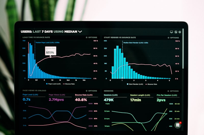
How I Built a Marketing Analytics Dashboard That Drives Decisions
Building a real-time analytics dashboard, integrating multiple data sources, visualizing KPIs, and using insights.
Most dashboards are data dumping grounds. They are where good metrics go to die. Here is how I build dashboards that don't just show data, but actually drive executive decisions.
The "So What?" Test
I have a rule. For every chart I put on a dashboard, I ask: "So what?"
Chart: "Traffic is up 10%."
So What? "I don't know."
Verdict: Delete the chart.
Chart: "Traffic is up 10%, but Conversion Rate is down 15%."
So What? "We are buying low-quality traffic. We need to check our broad match keywords."
Verdict: Keep the chart.
A dashboard is not a report card. It is a diagnostic tool.
1. Who is the Dashboard For?
One size fits none. I build three distinct views for every client.
View A: The Executive (The "Pulse")
Audience: CEO, CFO, Founders.
Questions they answer: "Are we making money?" "Are we growing?"
Metrics: Revenue, ROAS (Return on Ad Spend), MER (Marketing Efficiency Ratio), YoY Growth.
Frequency: Weekly / Monthly.
Format: High-level scorecards. Green/Red arrows only.
View B: The Manager (The "Strategy")
Audience: CMO, Marketing Director.
Questions they answer: "Which channel is working?" "Where should we move budget?"
Metrics: CPA (Cost Per Acquisition) by Channel, Funnel drop-off rates, LTV by Cohort.
Format: Trened lines, Bar charts for channel comparison.
View C: The Specialist (The "Tactics")
Audience: PPC Manager, SEO Lead.
Questions they answer: "Why did CTR drop yesterday?"
Metrics: CPC, CTR, Impression Share, Page Load Time, Bounce Rate.
Format: Detailed tables, Heatmaps.
2. The Architecture: GA4 -> BigQuery -> Looker Studio
Stop connecting Looker Studio directly to GA4. I've written about why this fails (sampling, API quotas, slowness).
My Stack:
- Ingest: FiveTran or Supermetrics pulls data from Facebook, LinkedIn, TikTok, and Stripe.
- Store: Google BigQuery. This is the single source of truth. All data joins happen here.
- Visualize: Looker Studio (free) or Tableau (enterprise). They simply read the clean table from BigQuery.
This makes the dashboard fast (loads in seconds) and accurate (no sampling).
3. Data Visualization Best Practices
I follow the "Gestalt Principles" of design. Cleanliness reduces cognitive load.
- Use Time Series for Trends: An isolated number (e.g., "100 Leads") is meaningless. "100 Leads (vs 80 last week)" is a story.
- Use Bar Charts for Comparison: "Google Ads vs Facebook Ads".
- Use Scatter Plots for Correlation: "Spend vs Revenue".
- Remove Chart Junk: No 3D pies. No gridlines unless necessary. No "cute" backgrounds.
4. The "Alert" System
A dashboard requires you to log in. That's a friction point.
I build automated alerts using Google Sheets Scripts or Slack integrations.
"Alert: Daily Spend on Facebook dropped by 50%. Check for credit card failure."
"Alert: Conversion Rate on Landing Page B dropped below 2%. Check for broken links."
This moves analytics from "Reactive" (checking the dashboard on Monday) to "Proactive" (fixing the issue on Tuesday morning).
5. Visualizing Ad Spend Specifically
Ad data is complex because of attribution. I create a specific "Sankey Diagram" for ad spend.
Left side: Spend Source (Google, Meta).
Middle: Campaign Type (Brand, Generic, Retargeting).
Right side: Outcome (Leads, Revenue).
This visual flow shows stakeholders exactly where the money is leaking. It usually reveals that "Retargeting" is claiming all the credit while "Generic Search" does all the work.
Conclusion
Building a dashboard is like building a product. You must interview your users (stakeholders), prototype, iterate, and launch.
Don't just give them data. Give them clarity. If your dashboard doesn't change a decision, it shouldn't exist.
Visualize Your Success
A dashboard is only as good as the decisions it drives. Build reports that stakeholders actually love to read.


