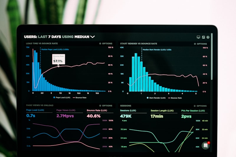
The Dashboard Lie: A Story of Vanity Metrics and Real Growth
I used to chase clicks. Then I learned to chase revenue. A story about how cheap traffic almost killed a campaign and how 'boring' data saved it.
The Dashboard Lie
It was 2018. I was presenting a monthly report to a SaaS client. The dashboard looked green. Impressions were up 40%. Clicks were up 25%. CPC was down 10%.
I felt great. I walked into that meeting ready for a high-five.
The founder looked at the screen, then at me, and said: "This looks great, Aneek. But why is our bank account empty?"
That moment changed my career.
I realized I had fallen into the classic trap of digital marketing: I was optimizing for activity, not outcomes.
The Metric That Betrayed Me: Bounce Rate
Let's talk about a specific disaster. I was running a campaign for a lead magnet—a free ebook. We were driving cheap traffic from Display Ads.
The Numbers:
- CTR: 0.8% (Decent for Display)
- CPC: $0.35 (Very cheap)
- Bounce Rate: 92% (Disaster)
I ignored the bounce rate. I thought, "Hey, we are getting clicks for 35 cents! We just need to tweak the landing page copy."
I spent weeks A/B testing headlines, button colors, and images. I moved the form up. I moved the form down. I added testimonials.
The result? Bounce rate dropped to 89%. Conversion rate stayed at 0.5%.
The Realization
I finally stopped staring at Google Analytics and looked at the source. I pulled a placement report.
90% of our traffic was coming from mobile game apps. These weren't interested prospects; they were people trying to click an "X" button to close an ad and accidentally clicking my banner.
I wasn't having a landing page problem. I was having a traffic quality problem.
The high bounce rate wasn't a sign of "boring content." It was a sign of "accidental clicks."
The Pivot: Tracking the "Un-Trackable"
We killed the Display campaign immediately. We moved the budget to High-Intent Search.
The New Numbers:
- CTR: 4.5%
- CPC: $4.50 (10x more expensive!)
- Bounce Rate: 45%
On the surface, my "metrics" looked worse. My CPC skyrocketed. My total traffic dropped by 80%.
But then we looked at the metric that matters: Sales Qualified Leads (SQLs).
The cheap traffic had generated 0 SQLs in a month. The expensive traffic generated 12 SQLs in the first week. The Cost Per Lead went up, but the Cost Per Acquisition (CPA) plummeted.
Lesson: Cheap traffic is the most expensive thing you can buy if it doesn't convert.
How Strategy Shifts Numbers
This experience taught me to look for the story behind the numbers. Here is the framework I use now:
1. The "So What?" Test
If a metric goes up, I ask "So what?"
"Traffic is up." -> So what? -> "More people are seeing our offer." -> So what? -> "Are they buying?"
If the answer is no, the traffic metric is vanity. I use advanced conversion tracking to ensure every click is tied to revenue.
2. Segment or Die
Averages lie. An "average" conversion rate of 2% might hide the fact that Mobile is converting at 0.1% and Desktop at 8%.
I started breaking down every report by Device, Location, and Audience. We found that for one client, iOS users were worth 3x more than Android users. We adjusted bids accordingly and increased ROAS by 40% overnight.
3. The Human Context
Data tells you what happened. It never tells you why.
When our email open rates dropped, the data didn't say "Your subject lines are boring." It just showed a red arrow.
We had to look at the human context. We realized we were sending emails at 6 PM on Fridays. People were leaving work. We shifted to Tuesday mornings, and open rates recovered.
Reading Beyond the Dashboard
Today, when I look at a campaign, I don't just see numbers. I see behavior.
A high Time on Page means "This is interesting."
A high Exit Rate on the checkout page means "This is confusing or shocking (shipping costs?)."
I use tools like content analysis to ensure my message matches the intent. I use URL extractors to analyze competitor structures.
The Ultimate Lesson: Metrics are not the goal. They are the map. The goal is the destination (Business Growth). If your map says you are making good time, but you are driving off a cliff, you need to look up from the dashboard.
Stop Guessing. Start Growing.
Is your data telling you the truth? Or are you drowning in vanity metrics? Let's audit your tracking setup and find the revenue hiding in your reports.
Get a Data Audit


