Why Dashboards Rarely Answer 'Why' (And The Limits of Looker Studio)
Dashboards describe what happened, but they fail to explain why. A manifesto on the importance of exploratory data analysis in spreadsheets.
The Comfort of Green Arrows
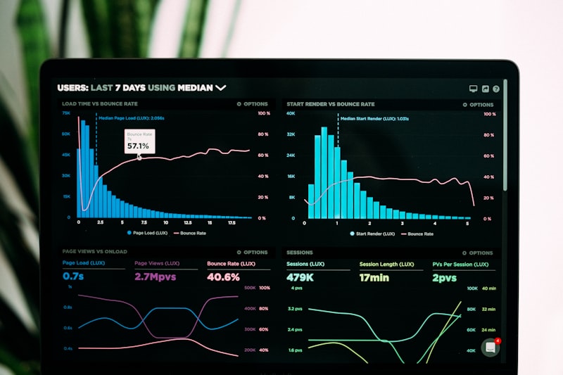
Dashboards are addictive. They provide a sense of control. You log in, you see Green Arrows pointing up, and you feel good. You see Red Arrows, and you panic.
But dashboards are fundamentally descriptive. They tell you what happened.
- "Traffic is down 10%." (What)
- "Conversion Rate is 2.5%." (What)
They almost never tell you why.
I have seen marketing teams spend hours staring at a Looker Studio report, debating why the numbers changed, making wild guesses. "Maybe it's the seasonality?" "Maybe the ad creative is fatigued?"
Guessing is not analysis.
The Limitation of Pre-Defined Questions
A dashboard is a set of pre-defined questions. When I build a dashboard, I am deciding weeks in advance what you should look at. "You should look at Sessions by Channel."
But the answer to "Why?" usually lies in the data I didn't put on the dashboard.
Example: A client's revenue dropped. The dashboard showed traffic was stable. Conversion rate was down.
The team stared at the "Conversion Rate by Channel" chart. All channels were down. They were stumped.
I left the dashboard. I opened the raw data in Sheets.
I started exploring. I pivoted by Browser. Nothing. I pivoted by City. Nothing. I pivoted by Screen Resolution.
Bingo.
Conversion rate for a specific mobile resolution (common on new iPhones) had dropped to 0%. It was a UI bug. The "Buy" button was floating off-screen on the new iPhone update.
No dashboard I would have ever built would have had a "Sales by Screen Resolution" chart. It's too niche. But that's where the "Why" was hiding.
Exploration > Reporting
To find the "Why," you need Exploratory Analysis, not Reporting.
Reporting is passive. It's checking the weather.
Exploration is active. It's digging a hole.
This is why I insist that every analyst needs to be comfortable with raw data manipulation (Sheets, SQL, Python). If you are stuck within the UI of Looker Studio or GA4, you are stuck within the questions the dashboard designer thought to ask.
The Mindset Shift
Stop treating the dashboard as the Oracle. Treat it as the Smoke Alarm.
When the dashboard beeps (Red Arrow), don't stare at the smoke alarm. Go find the fire.
Leave the tool. Export the data. Segment until you find the anomaly. That is where your value as a human lies. AI can generate dashboards. AI cannot (yet) understand that a specific screen resolution bug is killing your Q3 bonus.
Move beyond "What" to "Why".
Dashboards are just the beginning. Real growth comes from deep-dive exploratory analysis that uncovers hidden revenue blockers.
Find The "Why" In My Data


